Tuesday, September 13, 2011

Mobile eCommerce in Northern Vermont

My wife and I were on vacation in northern Vermont last week and happened to stop at a farmer’s market in Morrisville. While I was wandering around, I stopped at a booth run by a woman selling meat and, after some discussion about the offerings, learned that she took credit cards by running the cards through a plug-in swipe unit from Square, at https://squareup.com/, that attached to her iPhone.
Two things struck me about this.
  • The fact that mobile ecommerce has penetrated a small town in Vermont with no high-tech tradition. In other words, mobile ecommerce is becoming ubiquitous.
  • The simplicity of the equipment and configuration. (See the Square site.) The woman said she wasn’t a techie, but found the equipment and the service a snap to use.
It's an increasingly mobile future...

Thursday, August 18, 2011

Integrating Native Mobile Apps and “Help”

We often view native mobile apps and online help/doc as distinct and separate types of online outputs. (And we can create online help/doc, which I’ll simply refer to as “help” from here on, in three “mobile” forms – mobile-optimized WebHelp, regular WebHelp viewed on a mobile device, and ebooks. So it’s crucial to define what we even mean when we talk about “mobile”.)

Can we connect these mobile types of “help” to native apps to add online help to the apps? That’s the subject of this paper – connecting native apps to “help” in the form of mobile-optimized WebHelp like Flare’s WebHelp Mobile.
But why bother? Native apps (Flixster, CamCard, etc.) are supposed to be so easy to use that they don’t need online help. But that’s not always true. Some apps have “hidden” interface features that must be documented. Others may require “domain” knowledge that has to be made available to users. We can provide some of this information within a native app, but native apps aren’t designed to handle large amounts of text. So how do we make help or domain knowledge available to mobile device users?

This paper answers this question by looking at three topics:
·         Definitions – What’s a native app?

·         Usage flow  – How do native app users need to move between an app and its help? How can we make that happen?

·         Design – What design criteria do we need to consider when interfacing native apps and help?
In this paper, I’ll show the specifics of interfacing native apps to “help” using two tools, an app creation tool called MobiFlex (http://mobiflex.me) and Flare (http://www.madcapsoftware.com) as the “help” creation tool, with a focus on the WebHelp Mobile output created in Flare 6 or 7. (If you don’t use Flare or MobiFlex, use the concepts as the basis for talks with your IT group.)

Definitions

Terminology misunderstandings often cause problems so, before proceeding, some definitions:

·         App – Short for application but usually used in reference to mobile devices – e.g. “iPhone app”. Apps usually focus on one task, unlike feature-rich, often sprawling PC applications.
For this paper, I’ll define two types of apps:

·         Native – Reside on the mobile device, are written in the device’s native language, and can use the device’s native resources  – camera, accelerometer, GPS, etc. If the app collects or refers to data, that data can be on the device or on a server that the device accesses via the Internet.

·         Web – Run in a browser on any device from a smartphone to a PC. WebHelp Mobile is basically a web app, which means that a native app should be able to link to it via a standard web link.
(A third type, hybrid, are native apps that run primarily in a browser but communicate with the device’s native resources (camera, etc.). I’m not covering these apps in this paper.)

With these definitions, let’s assume you created a native app for an iPhone or Android using MobiFlex and need to connect it to “help” created in Flare’s WebHelp Mobile format.

How To Connect a Native App to a Web App


For this paper, I’ll postulate two styles of help connection – “Help-menu” and “context-sensitive.”
Help Menu-Style

This style can simply be a link from the home page of an app to the home page of the WebHelp Mobile, similar to the Help > TOC option in a standard Windows application. For example, tapping the WebHelp Mobile button in the screen below:


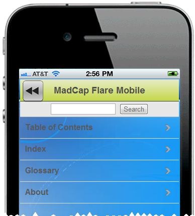
…opens the WebHelp Mobile by launching a hyperlink to the URL of the WebHelp Mobile home page, shown below:


Once in the WebHelp Mobile, users can access the navigation featured defined in the WebHelp Mobile skin – Table of Contents, Index, etc. But how do users go from the WebHelp Mobile back to the app page where they launched the WebHelp Mobile? The solution is to add a “back” button, such as at the one at the upper left corner of the screen below.


This is easy. But what if you need more buttons? They’ll cover the WebHelp Mobile title bar. You could fix this by resizing and moving the window in which the WebHelp Mobile displays, as shown below.


This layout is similar to the previous one, except that I moved the WebHelp Mobile window down to add room for buttons without overwriting the WebHelp Mobile title bar. However, if all you need is a “Back” button, then this approach wastes a lot of already-limited screen space. It depends what you need to do. (You could also use a smaller button image for a better visual fit on the screen, as long as the button was still large enough to be easily tapped with a fingertip.)
Context Sensitive-Style

Context sensitive-style is similar to the Help menu-style above, with one big difference. The Help menu-style assumed you’d always go to the help from a specific app page and always return to that app page. This meant the “back” button could simply be a URL link to that app page.
Context sensitive-style still takes you from an app page to the help but the “back” button must now take you back to the app page where you launched the help, which may differ each time. This means that the “back” button can no longer be a URL link to one app page. Instead, it has to know your path through the material in order to provide a “back to previous” function. How you do this depends on the code you insert or the tool you use to create the app. (I’m assuming here that you created the help using Flare.) If you’re using MobiFlex’ visual authoring, here’s what the options look like:


This is the property sheet for an image button. The important part is the dropdown with “Go to previous page” selected. That’s all you need. It means that each page in an app can link to a page in the WebHelp Mobile. After users enter the WebHelp Mobile, move around it by using the WebHelp Mobile navigation features, and then decide to return to the app, tapping the “back” button takes them to the app page where they invoked the WebHelp Mobile in the first place. All controlled with one “back” button on the WebHelp Mobile page. The result is effectively context-sensitive help for the app pages.
Some Design Considerations

This process is mechanically straightforward, especially if using Flare and MobiFlex. But there are some design considerations to keep in mind. Here are three major ones:
·         Should the app and the help look alike? It depend on your needs. You might say yes, to maintain visual consistency in the interface, or no, to visually distinguish the app from the help.

·         If the app supports orientation shifting – e.g. shifting from portrait to landscape mode if the user moves the phone, should the help orientation shift too? If it doesn’t, might users get annoyed as they have to rotate the phone 90° each time they switch between the app and the help?

·         Flare authors tend to think in landscape mode, but mobile devices may be portrait oriented. This means that Flare authors must create projects that can easily shift from the landscape mode of a PC screen to the portrait mode of a phone. That means using relative measures like % or em instead of points in the CSS.

You’ll probably find more specific issues of your own.

Summary


This simple visual approach (based on using tools like Flare and MobiFlex), breaks down walls between native apps and web apps like WebHelp Mobile. It lets technical communicators start creating online help for native apps, like we did for PC applications twenty years ago. It extends the capabilities of both tools. And technical communicators who become familiar with tools like MobiFlex can extend their skills into native mobile app development. The result is greater and more flexible development capability.
Note – If you’d like to see the app and WebHelp Mobile in action or see the underlying code, contact me at nperlin@nperlin.cnc.net and I can activate the app for you to try on an iPhone 4 or Android 2.2 phone or show the coding in MobiFlex.

Note - This post is also available on the MadCap Software site at http://www.madcapsoftware.com/company/industrybuzz.aspx

Friday, August 12, 2011

Answers to Last Questions From 8/10-11 Flare CSS Class

Hi folks,

Here you go...

Re where else to find the description of the mc commands – download the Flare Styles Guide PDF (see the link in the footer in any Flare help topic). The commands were apparently added recently.

Re the topic popup style customization, covered on pg. 61 of the wokrbook, not working – the instructions in the workbook are correct. Tech support took a look, reapplied the popup style, and it worked. So either I misapplied the popup style to the link text or else I accidentally turned it off and didn’t notice that I’d done so. One of those forehead-slapping events that I mentioned.

Cheers,
Neil

Friday, June 17, 2011

Presenting Two Webinars On Mobile for MadCap Software

Mobile has become a hot topic in the last few years, and you may be thinking about using it for your online help and documentation. But what benefits does it offer? For what kind of applications? What’s the difference between web apps, regular web sites, native apps, and ebooks, and how might those differences affect your mobile strategy?

You could buy and learn brand new types of software for creating mobile, with the effort and expense that entails. But if you have Flare 6 or 7, you’ve got an alternative – you can convert existing projects to mobile form with minimal expense and effort by simply using a few new Flare features and using some familiar Flare features in new ways.

This two-part webinar explores both issues – the general mobile “ecology” to provide a framework for your mobile strategy, and the specifics of creating mobile output using Flare.

Part 1 – “Native Apps?” “Web Apps?” What IS This Stuff? – An Overview of the Mobile Ecology

Part 1 looks at the general mobile ecology. We’ll review the rationales for and benefits of using mobile, some basic terms (feature phones vs. smartphones), delivery “mechanisms” (apps vs. sites vs. ebooks, etc.), major platforms (Android, Apple, etc.), the effect of device differences (such as how differences between smartphones and tablets may affect your choice of delivery mechanism), and suggestions on developing content strategy and standards, and market research to determine your direction.

Part 2 – “So How Do I Use Flare To Go Mobile?

Part 2 looks at the specifics of creating mobile output with Flare. We’ll review the overall process of converting a Flare project to the WebHelp Mobile output and look at typical results – what features convert well, poorly, or not at all, and the effect on workflows and project planning. Finally, we’ll do a live demo to see the process in action.

Part 1 - Jul 22, 10:00-11:00 am (Pacific Time)

Part 2 - Jul 27, 10:00-11:00 am (Pacific Time
)

To sign up, go to http://www.madcapsoftware.com/demos/webinars.aspx

Saturday, April 23, 2011

Responses to Questions From Last Week's STC Webinar on Content Strategy

Kathryn S: On the "And Some Specific Ones..." slide, I just wanted to let you know you have a missing "s" on "ideas."
Neil – There’s always something... :-0 Thanks…

Tony C: Have you found any free offline validation tools? I like jigsaw too, but I work for companies that don't let me use externally hosted validators.
Neil – Good question. I Googled “w3c offline validator” and got a bunch of hits but I can’t speak about any of them. What I’d do is talk to your developers to see what offline validators, if any, they use, since they must have the same restrictions that you do. If that doesn’t help, ask the developers for recommendations for web developer forums, perhaps on LinkedIn and elsewhere, and post the question there.

Jody T: Do you think RoboHelp is becoming an obsolete tool? We have a very OLD version and we are working on moving documents to a SharePoint Content site(s)
Neil – Not at all. Any help authoring tool that survives in today’s competitive market is a solid tool. However, there are two additional considerations. First, RH is old (debuted in ’91, RH HTML in ‘98), so there’s a huge tail of legacy projects that Adobe has to support. Second, depending on how old your version is, you may be having problems because a) it IS an old version with bugs and peculiarities that may have been fixed in later releases but not in yours, and b) your authors may have done, and still be doing, things that go against today’s standards and best practices because those standards and practices didn’t exist when your company’s development practices evolved. There’s a lot more that can be said here but I don’t know how proprietary this issue is to you, so feel free to email me offline – nperlin@nperlin.cnc.net.

John L: How would you plan to include measurements and metrics that quantify a tech content creator's "productivity"?
Neil – You have to quantify productivity in two ways. One is obvious – metrics to see how efficiently you’re producing your doc. Those are essentially production metrics. Second, and more important, are strategic metrics, metrics that demonstrate how doc is helping the company with its larger strategic business mission. I’d have to know more about your company to get specific, but the obvious ones are things like reduced expenses (which is sort of like increased revenues) because of reduced tech support calls due to better doc, improved user retention due to better doc, an increase in the number of new customers because of the Captivate video of the product that you added to the company’s main web site, and so on.

Kathryn S: Can you give us a sample document or template that we can base our strategies on?
Neil – Companies are so different that it’s hard to say, beyond what I noted in the webinar, without much more specific detail. However, I’d mentioned what I consider to be a useful thought-provoker and promised to list it – it’s a book called “Maximizing Project Value”, Jeff Berman, AMA Books, www.amacombooks.com. It is something of a marketing blurb for a project metric methodology, but he does add what I consider to be a lot of thought-provokers. I’ll add (sales pitch warning) that I do this on a consulting basis and would be happy to talk to you offline if you’re interested. You’ll also find a number of presentations on the subject at the Summit if you happen to be going.

David C: Looking for starter info for application of content strategy in a research org like a GOV agency where the primary web content is information and publications
Neil – Without a lot more detail, I’d tell you to see my previous response to Kathryn S. We can also talk at the Summit.

Hope this helps.


Regards and thanks for attending,
Neil

Thursday, March 24, 2011

“Mark of the…” What?

If you use MadCap Flare, Adobe RoboHelp, and probably any other HAT (help authoring tool), you may have noticed the intriguingly-named Mark of the Web option in the output settings. Mark of the Beast jokes aside, what is this?

If you use IE 7 or 8 (and some earlier service packs), you know that after you generate a browser-based output like WebHelp and then try to view it, the output doesn’t display. Instead, the browser opens with a yellow bar that reads “To help protect your security…” just above the display area. To view the output, you must click on the blocked content bar, click the Allow Blocked Content… option, and finally click Yes to the security warning message. Only then does the output display.


The blocked content… feature has nothing to do with help authoring per se. It’s a security feature in IE that has the side effect of blocking the display of HTML and XHTML files, which the help topics are, when you run them from your local PC. Where help authoring is concerned, it’s harmless but mildly irritating. Selecting the Mark of the Web feature, often referred to as MOTW, lets you deal with that irritation by turning off the blocked content bar and displaying your output immediately.

According to MSDN…

“The Mark of the Web (MOTW) is a feature of Windows Internet Explorer that enhances security by enabling Internet Explorer to force webpages to run in the security zone of the location the page was saved from—as long as that security zone is more restrictive than the Local Machine zone—instead of the Local Machine zone. When you are developing webpages, the MOTW enables you to test your HTML documents in the security zone where you intend the pages to run. Adding the MOTW to your webpages also enables you to fully test their compatibility with users' security settings.” (http://msdn.microsoft.com/en-us/library/ms537628(v=vs.85).aspx)

So why not turn on MOTW all the time? The blocked content bar only appears when you view your output or HTML/XHTML files on your local PC. It does not appear when you view your output or HTML/XHTML files on a network drive or server. So if users will view your output on a network drive or server, there’s no reason to use MOTW. If users will view your output locally, on the C drive, for example, you might use MOTW. But be aware that MOTW also causes two odd problems in help authoring:

• If you created links in your topics and turn MOTW on, those links don’t work when you preview topics in your HAT. Confusingly, however, they do work in the output. So there’s the risk of wasting time trying to figure out why the links don’t work except when they do.

• If you created links in your topics to external files like PDFs and turn MOTW on, the external links don’t work in the preview or output. They look fine… they just don’t work. So, again, there’s the risk of wasting time trying to figure out why regular links do work but external links don’t. It’s a problem whose solution – turn off MOTW – is simple but totally unintuitive.

The upshot… You might want to turn MOTW on during development to avoid having to click through the blocked content bar each time you review the interim output. Just be aware of the authoring problems and be sure to turn MOTW off when you generate your final output.

Thanks to Jerry in San Jose and the crew is Brisbane for motivating me to finally write this. :-)

Saturday, March 12, 2011

What’s New in Flare 7 – QR Codes

Continuing my posts about features in version 7 of MadCap Flare… Here, I’ll look at one of the more unusual features – QR Codes.

QR codes are one of those features that’s so unusual that the first reaction is “um, yes…” followed by “Whoa!” (Another such feature is the toggler link.) If you’ve recently seen something that looks like this, you saw a QR code.


Think of QR codes as an expanded form of the familiar bar code. QR (Quick Response) codes were created, according to Wikipedia (http://en.wikipedia.org/wiki/QR_Code) by Toyota subsidiary Denso-Wave in 1994 for parts tracking during manufacturing and are read by dedicated readers for manufacturing. But what makes them interesting for tech comm is the spread of smartphones equipped with readers. Scanning the code above on my smartphone registers a link to my web site at www.hyperword.com. Clicking that link then jumps to the site, without having to physically type a URL.

What can you do with QR codes? Here are some examples, starting with three from the “About QR Code” topic in the Flare online help:

• You want to give users the ability to jump to your company web site from a PDF or print manual. You could list the URL for users to type, but instead you insert a QR code containing the URL. Users can simply point their smartphones at the code to read the URL, then launch it.

• You’re creating a quick reference guide. Like all such guides, it sharply limits the amount of information you can include, so you give users access to further details by inserting QR codes in the quick reference that link to the full documentation in the form of a WebHelp-based help system on a server. Or the codes might jump to web pages running videos or SWF movies showing how to perform a related task mentioned in the quick reference.

• You could use the codes as a sales tool. For example, you put a QR code on the cover of a sales brochure. When readers scan that code, it takes them to a web page where they can order your product.

And from my own experiments, experience, and research, use it:

• As a brand differentiator – like a sales tool but one that says to certain audiences that you’re cooler than your competitors.

• As a sales tool in situations where prospective customers can’t write down your information because they’re driving or hanging onto a strap on a subway. (I recently saw a two foot high QR code painted on the back of a delivery service truck. If I was interested in the service and had my smartphone at hand, I could have simply scanned the code and gotten the URL for the company.)

• For marketing with response tracking. There are a number of useful threads about this on the Mobile Content group under LinkedIn.

• For any other case where it’s just inconvenient to type a URL. (I have large hands and find it very difficult to type on a smartphone keyboard, virtual or real. I’d find a QR code a helpful substitute.)

How to read QR codes on your smartphone? Easy – get a reader app from your vendor’s app store/market. I have two, ConnectMe QR for my iPhone 4 and Google Goggles for my Android phone, a Samsung Captivate. Both worked like a charm, and are free. Start the app, point the camera at the QR code, and wait a few seconds. Each app read the QR code and popped up the information on the screen. For example, the QR code I showed above is for my web site at http://www.hyperword.com/. Here’s how the ConnectMe QR app read it off my laptop screen in about a second:


So how do you create these codes using Flare? It’s almost the same as inserting a graphic, the difference being that you can actually see Flare’s QR code generator create the code as you specify the code’s content. To do this:

Click in a topic where you want to add the code and select Insert > QR Code. In the Insert QR Code dialog box, select the content type – Text, URL, Email…, Contact Information, or SMS. The dialog box settings change accordingly. For example, if you select Text, Flare simply waits for you to start typing. However, if you select Contact Information, fields appear for Name, Company, and so on. Fill them out and you’ll see the code taking shape in the Preview pane.

You can also control the size of the code, which may be handy if you create one with lots of information that may be read in shaky or blurry environments. For example, I found that when I entered some marketing text (see the next paragraph) and used the default code size, both my readers took longer to interpret the code than they did when I enlarged the code. I’m not sure if that was the reason why but the difference was noticeable. Finally, you can attach a style class and a screen tip to the code and set display elements like position, borders, margins, and a background.

Is there a limit as to how much you can put into a QR code? Yes, depending on the nature of the content - 4296 alphabetic characters or 7089 numeric characters, with some variations - according to an article at http://qrbcn.com/imatgesbloc/Three_QR_Code.pdf. It should be enough for many uses. Here, for example, is a marketing piece about an upcoming mobile app authoring class that I’m teaching – “Mobile app authoring without coding – ½ day remote class on 3/21/11 – contact nperlin@nperlin.cnc.net for information”

Here’s what the code looks like:


And here’s the perfect result:


I’m not sure yet of everything for which I might use QR codes, but I can see a lot of possibilities.

More to come…


Monday, March 7, 2011

What's New In Flare 7

This is the first of several posts on the newly-released version 7 of MadCap Flare. Flare 7 adds many new features, including more powerful SharePoint support, native Subversion support, support for vector graphic formats like EPS and SVG (Scalable Vector Graphics), linking to external files to use in multiple projects, a revised editor for adding and maintaining context-sensitivity codes, the ability to preview topics in any target you defined, the ability to view generated output in any browser on your PC, QR (Quick Response) codes, an equation editor that uses MathML (Mathematics Markup Language), numerous enhancements to table support, and more. In this post, I’ll look at the support for tables, a seemingly mundane feature that’s actually anything but.

Tables can be troublesome, especially those in topics created by imported Word or Frame files. Flare has had some powerful table features since v. 1, but v. 7 adds some significant extensions. Here’s a quick look at some of what I consider to be the most significant.

Revised Table Style Editor

The TableStyle editor hasn’t changed for a while, but has been reorganized in v. 7. Here’s the TableStyle editor in v. 6 for reference:


And here it is in v. 7:


Note several changes…

• The generic term “patterns”, referring to groupings of row/column/etc. properties, is now more element-specific – “row styles”, “column styles”, etc.

• It’s easier to change the sequence in which particular row or column styles should apply in a table. For example, if you created row style 1 with a green background and row style 2 with a red background and then decide to reverse their sequence, you can simply click on either of the styles, then click the up or down arrow to the right of the style.

• Features are now functionally grouped – “Column Properties” and “Background” – rather than appearing somewhat scattered around the editor screen. I believe this improves the overall usability of the editor.

The TableStyle editor’s title bar also adds two features – Medium and Apply Style….

• Medium adds the power of mediums in the regular Stylesheet editor to tables. If you’re new to mediums…

Mediums are alternate groups of properties for alternate outputs in one table style sheet. Let’s say you output to WebHelp and PDF and want to use navy for header rows in WebHelp but black in PDF, and keep all the other table styles the same. You might create one table style sheet with separate mediums for WebHelp and PDF, assign different values to the header for each medium, then tell Flare which medium, and thus header values, to use for which output. For example, you might select your PDF medium to set all header rows to black for a PDF target, and the Default medium to set all header rows to navy for WebHelp – all from one table style sheet.

This can reduce your table style maintenance work since there’s only one table style sheet to maintain and just a few settings to actually define for each medium. Mediums can be confusing if you’re not careful, but the reduction in maintenance work makes them very useful for single sourcing to different formats and output devices.

• Apply Style… lets you select multiple topics, or folders-full of topics, to which to apply a table style sheet. You can also overwrite existing table styles and remove local formatting in the tables. The former is useful; the latter may be enormously useful if you import legacy Word files containing tables.

There’s another feature on the editor that’s easy to miss because of an interface change in Flare 7. In 6, there was only one vertical scroll bar for the TableStyle editor, as shown in the image below.


In 7, below, there are two vertical scroll bars, one for the upper (settings) portion of the editor and one for the lower (preview) portion. Why does this matter?

• One is convenience. In 6, if you wanted to see the options in the lower part of the settings section, you might have to shrink the preview section. In v. 7, you can just scroll down the settings section without changing the size of the preview section.

• There’s also a new feature. Scroll down the settings portion of the editor in 7 and you’ll see an Advanced button at the bottom of the …Properties section. Clicking it displays a Breaks control dialog box that lets you further format the table.


Two more features that many people, including me, have wanted have now been added – the ability to convert tables to text and vice versa. You could convert text to a table by inserting a new table and dragging the text into the cells, but that’s slow. Better to be able to select text and convert it to a table in one step. The feature isn’t immediately obvious; you’ll look on the Table menu for a Convert Text to Table feature and not find it. It’s actually on the Insert Table dialog box in the Text to Table section, shown below, with options for splitting the text on paragraphs, commas, or other markers.


How well it works in practice depends on the cleanliness of the text. Ignoring that issue, this should be a very good productivity improvement feature.

Some other useful new features include merging adjacent tables, not just adjacent cells, and pasting cells from one table into another. You can also merge, split, and clear cells, apply and change cell content styles and cell classes, resize tables, all features that date to v. 6 or earlier and have been retained in v. 7.

The table features also offer two tricks that can fix some annoying problems you may run into. These tricks aren’t new but you may not know about them if you haven’t taken one of the training classes, talked to a consultant, or just experimented a lot.

Trick 1 – Local Formatting In Tables Breaks Table Style Sheets

Ever apply a table style sheet to a table and find that some settings don’t work for some reason? Often, the problem is that the table contains local formatting. This can happen in tables in topics created from imported Word documents, or tables created in Flare and hand-formatted to get a particular look. Local formatting overrides styles in table (or any) style sheets. You can try to fix the problem by playing with the styles, but you may find yourself flailing. Or you can go into code to find and delete the local formatting code, but this can be difficult. (The first figure below shows a little table, the second shows the underlying code. It’s not easy to find the bad code in this.)


There’s a simpler way. Click in the table in the XML editor and select Table > Reset Local Cell Formatting. This automatically finds and deletes the offending code and the table style works instantly. This feature can fail on very problematic tables, but I find that it generally does work and, when it does, it’s sort of like magic.

Trick 2 – Header Row Settings in My Table Style Sheet Don’t Work

The TableStyle editor lets you define a header row as a separate item with its own distinct styles within a table. However, you may find that your header row styles don’t work on some tables. Often, you’ll find that these tables came in from Word files. In Word, if you’re like me, you count the number of rows needed for a table, then add one more to act as a header row. But Flare sees this as an ordinary row that’s acting as a header, not a programmatically defined header row, so the header styles don’t work. How to add a header row to these tables to get your header styles to work? It’s surprisingly easy.

Step 1 is to add the “Flare-compliant” header row. Click in the table, select Table > Table Properties, make sure you’re on the General tab, and change the Number of Header Rows field from 0 to 1. You’ve just added the programmatic header row. Step 2 is to move the column heads from their current row to the “real” header row. When you do, they take on the styles you defined for the header row in the TableStyle editor. You can then delete the original and now empty header row. That’s it.

Overall, a well laid out set of table manipulation features with some very useful additions.

More to come…